How Visual Branding Impacts Digital Marketing Conversions
INTRODUCTION
We often hear the saying, “People buy with their eyes first.” In digital marketing, this statement has never been more accurate.
Today, consumers scroll through thousands of visuals daily, including ads, videos, social media posts, website banners, and emails. In this crowded digital space, your brand has less than 3 seconds to grab their attention. That’s where visual branding plays a crucial role.
Visual branding is more than just a logo or color scheme. It represents your brand’s visual personality. It influences how people feel about your brand and whether they take action, like clicking, subscribing, or making a purchase.
In this blog, we’ll explore:
– Why visual branding affects conversions
– Key visual branding elements that influence buyer psychology
– Real-world examples of successful visual branding
– How to improve your branding to boost conversions
– Mistakes to avoid when designing for digital platforms
Let’s dive in.
What Is Visual Branding?
Visual branding includes all the visual elements a brand uses to convey its identity and values, such as:
– Logo
– Color palette
– Typography
– Graphic style
– Website design
– Product packaging
– Social media post aesthetics
In simple terms:
Visual branding = What people see + How it makes them feel
It’s not just about looking good. It’s about creating a visual experience that builds trust, consistency, and memory.
Why Visual Branding Influences Digital Marketing Conversions
- First impressions are 94% design-related
Research shows that 94% of first impressions about your brand come from design and usability, not content.
Example:
A messy landing page leads users to leave in 0.05 seconds.
A clean, visually cohesive page encourages users to read, click, and convert.
A visually appealing brand appears more professional and trustworthy, which motivates users to take the desired action.
- Consistent branding can increase revenue by up to 33%
When a brand maintains consistent visuals across platforms like Instagram, websites, ads, and emails, the audience starts to recognize and trust them. Trust leads to familiarity, which drives conversion. That’s why brands like Apple, McDonald’s, and Nike keep their fonts, colors, and tone consistent. Consistency builds brand recall, and recall drives conversion willingness.
- Visuals communicate faster than text
The human brain processes visuals 60,000 times faster than words. This means:
Users don’t read first; they see first.
If the design doesn’t grab attention, users won’t read the content. Your design should convey your message before your words do.
Emotional Design: How Visuals Trigger Buying Decisions
Instead of asking, “How should it look?” ask, “How should people feel when they see this?”
Different designs evoke different emotions:
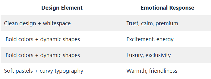
Example:
Luxury brands like Chanel and Dior use black, white, and beige with serif fonts to convey a premium feel.
Fast food brands like McDonald’s and KFC use red and yellow to stimulate hunger and urgency. Visual branding is linked to emotional psychology.
Key Elements of Visual Branding That Impact Conversions
- Color Psychology
Colors affect emotions, which in turn influence actions.
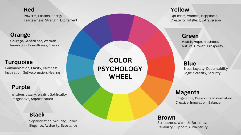
Ever wonder why most Buy Now or Shop Now buttons are red or orange? They create urgency. The right CTA color can boost conversions by up to 21%.
- Typography (Fonts)
Fonts communicate more than just words.
Example:
– Serif fonts convey tradition and trustworthiness.
– Sans-serif fonts appear modern and clean.
– Script fonts feel feminine and elegant.
Typography impacts:
– Readability
– Emotion
– Brand perception
Using Comic Sans for a luxury brand is like wearing slippers with a tuxedo—it kills the vibe.
- Logo Design & Placement
Your logo shouldn’t scream for attention; it should stand out.
Best practice:
– Ensure the logo is visible on every content piece.
– Position it consistently on landing pages (usually top-left).
– Maintain standard spacing around the logo to avoid clutter.
A clean logo promotes immediate brand recognition.
- Layout & Structure (Whitespace Matters)
Whitespace gives your design breathing room.
A cluttered design overwhelms users, leading to fewer conversions. A clean layout is simple, calming, and encourages action.
Simple design often results in higher conversions.
- Consistency Across Platforms
If your Instagram is pastel pink but your website features neon green and black, you lack a cohesive brand. Consistency builds trust, which drives conversions.
How Visual Branding Boosts Conversions Across Digital Platforms
- Social Media Marketing
Visually consistent feeds perform better both algorithmically and emotionally.
– Branded templates enhance recall.
– Consistent colors increase recognition.
– High-contrast CTAs encourage clicks.
Example: A brand sharing random designs is forgettable. A brand with a cohesive visual identity is memorable and professional.
- Website/Landing Page Conversion
Your landing page should:
– Be clean
– Have a visual hierarchy
– Direct the eye toward the CTA
The formula for high-converting landing pages:
Attention → Interest → Desire → Action
Design should capture Attention and Interest.
- Paid Ads (Facebook, Instagram, Google Display)
Ads require:
– High contrast visuals
– Clear CTA placement
– Strong visual hierarchy
When users scroll, your image should stop them, your headline should hook them, and your CTA should convert them.
- Email Marketing
Emails with branded visuals yield better click-through rates.
Make sure:
– Header images are on-brand
– CTA button colors are consistent across emails
– The color palette aligns with your brand identity
Case Studies: Visual Branding Equals Higher Conversions
Case Study 1: Airbnb
Airbnb established consistent visuals:
– Clean typography
– Pastel color palette
– Emotional travel imagery
Result: Conversion rates grew significantly. Brand trust improved, leading to more bookings.
Case Study 2: Apple
Apple’s designs are minimal, emphasizing whitespace, simplicity, and product focus. Their branding clearly expresses premium quality.
Result: They don’t need to persuade people; customers line up for their products.
Case Study 3: Coca-Cola
Coca-Cola uses red and consistent typography for instant recognition. Even without the logo, we can identify their ads.
Result: Strong brand recall increases purchase intent.
5 Visual Branding Mistakes That Kill Conversions
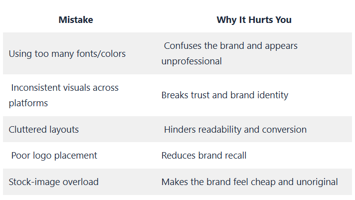
Branding should simplify, not complicate.
How to Build a Visual Branding System That Converts
– Choose a unique color palette
– Define 2-3 brand fonts
– Create social media design templates
– Maintain consistent logo placement
– Build a simple brand style guide
These steps ensure your team, freelancers, or designers follow the same style.
Action Plan: How to Improve Your Visual Branding (Step-by-Step)
Step 1: Audit your current visuals
Ask:
– Do all my platforms look like one brand?
– Are my designs consistent?
Step 2: Simplify your color palette
Limit to 3-5 brand colors.
Step 3:Create reusable design templates
For Instagram posts, ads, and presentations.
Step 4: Test and optimize
Run A/B tests on:
– CTA button colors
– Layout style
– Images vs. illustrations
CONCLUSION
Visual branding isn’t just about aesthetics. It’s a critical aspect of business psychology.
Your visuals influence:
– Whether people trust you
– Whether people remember you
– Whether people take action
Good design gets attention. Great design leads to conversion.
Visual branding turns attention into interest and interest into conversion.
Lorem ipsum dolor sit amet, consectetur adipiscing elit. Ut elit tellus, luctus nec ullamcorper mattis, pulvinar dapibus leo.